Office of Marketing and Communications
The Office of Marketing and Communications provides innovative and strategic solutions to support the university's goals and tell College of Charleston's story. Whether you need assistance with creative projects, video production, photography, websites, or telling your area's unique story, our team is here to help!
On-campus partners should visit The Hub for in-depth resources and to submit requests for services.
University Marketing
The University Marketing team plans, implements and manages comprehensive marketing programs and initiatives for divisions and departments across the campus. They approach projects strategically and produce materials to help campus partners meet their stated goals. It is also their responsibility to ensure that all marketing and communications materials, whether developed by internal units or outside vendors, reflect a consistent expression of the College of Charleston brand.
External vendors
We often work with external vendors and partners. Please review the brand guidelines for high-level brand information. If you have a question about using the College's logo or other brand elements, please email University Communications, senior director of brand marketing. All designs developed by outside vendors, should be submitted to University Marketing for review and approval. Licensing information can be found at clc.com.
University Communications
University Communications is the official source of news and information about the university. The team tells the stories of the College, its programs and people through a variety of channels and outlets, press releases, The College Today, College of Charleston Magazine, Faculty & Staff News, podcasts and a variety of publications. The team also assists the campus community with their outward facing communication needs and is the primary point of contact for all news media requests.
Related News

Charleston Athletic Fund Virtual Auction Now Open

The Ripple Effect of Denny’s FUNd: Connecting Campus Community Through Fun, Fellowship

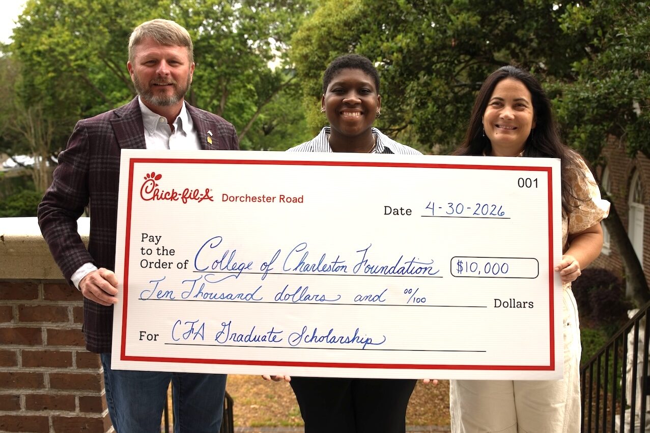
Chick-fil-A Scholarship Creates Opportunities for Continuing Education